CASE STUDY
Soulfruit
Find your therapist app
Project Summary
My Role: Product Designer (UX/UI)
Timeline: 6 months
Tools Used: Figma, UserTesting, Useberry, Miro
Project Type: Mobile App
Background: Soulfruit is a mobile app customized to help people, specifically BIPOC individuals, find and connect with therapists. Its mission is to break down the social barriers to mental health by offering affordable options for those seeking support. Soulfruit targets customers like busy working professionals or individuals struggling with mental health.
Challenge: Young adults struggling with their mental health and looking for a therapist.
Solution: To provide a simple way for users to begin and customize their search for a therapist.
Research
I conducted interviews and created empathy maps to understand the users I designed for and their needs. A primary user group identified through research was people of color overwhelmed by searching for therapy. This user group confirmed initial assumptions about the difficulty of finding a therapist with a diverse background. The research revealed other concerns such as time, cost/insurance coverage, and a general understanding of where to begin.
User Pain Points
Cost
Limited or lack of insurance coverage and options for mental health support.
Time
Adults are too busy to conduct blind searches on Google for therapy.
Unfamiliarity
Communities lacking mental health resources and general awareness.
Persona and Problem Statement
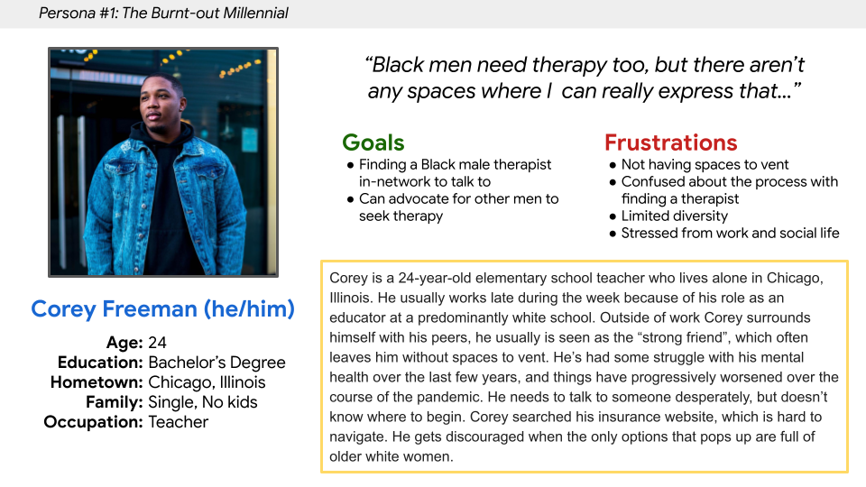
Corey is a burnt-out teacher who needs to find a therapist because he does not have a safe space to decompress and is going through a mental health crisis.
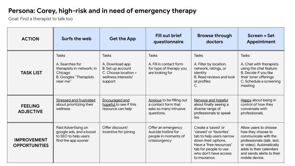
User Journey Map
Mapping Corey’s user journey revealed how helpful it would be for users to have access to a therapist-finder app.
Ideate & Design
Paper Wireframes
I played crazy eights to allow myself to quickly iterate on each screen without getting held down on the small details. After narrowing down the sketches I created, I prioritized the advanced search feature for the home screen.
Digital Wireframes
As the initial design phase continued, I created digital wireframes based on the paper versions. I allowed myself to iterate a couple more times on the digital versions to make sure the flow made sense before user testing.
Usability Testing
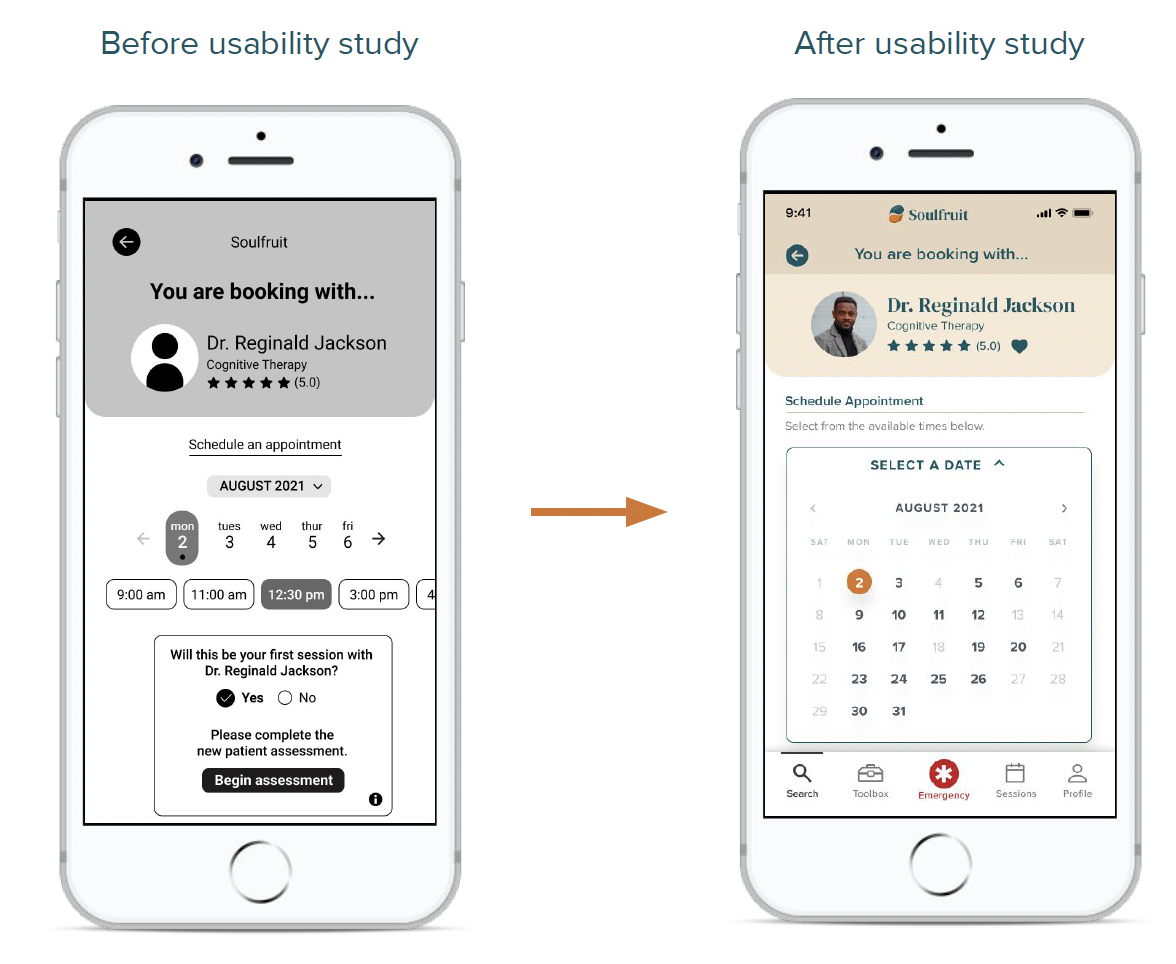
I went into testing soon after—conducting two rounds of usability studies—and updated the designs based on real user feedback. I discovered that it was important for users to easily review and set up appointments with their therapist. This prompted me to update the user flow with a disclaimer before going into the assessment screens.
Upon editing and refining the digital wireframes based on my research, I created a low-fidelity prototype that you can explore here.
Round 2 Findings
Users want a full calendar view for scheduling appointments
Round 1 Findings
Users want to view costs prior to their booking
Users want to easily review each doctor’s profile
Users need a disclaimer before the intake assessment
Iterate & Refine
Mockups
In early designs, I streamlined the homepage to focus on key factors that would help start a user’s search. I redesigned this when the first usability study revealed that users wanted an opportunity to input the insurance/cost options at the beginning of their search.
The second usability study revealed frustration with the scheduling appointment flow. So, I updated the calendar so the user can view the doctor’s full schedule. I also have the information pop-up one step at a time to encourage users to focus on one step at a time.
Accessibility Considerations
Screen Readers
Provided access to users who are vision-impaired through adding alt text to images for screen readers.
Icons
Used icons to help make navigation easier.
Voice or Video
Offers meeting options like video chat and voice call for users with varied needs
High-Fidelity Prototype
The final high-fidelity prototype presented cleaner user flows for finding and scheduling a therapist. It also allowed me to include the user needs for advanced search and organization of scheduling.

“Overall this app was very easy for me to use!”
- Usability Testing Participant
Challenges and Opportunities
This app is the beginning stage for users to invest in their mental health and begin their search for a therapist. Throughout this project, I’ve learned the power in research and data to drive design decisions in order to create the best experiences. I’ve also been able to reflect on accessibility best-practices for building products and design systems in Figma.
Next Steps
Test and iterate on the emergency contact screen to ensure it’s feasible for users.
Create a ‘profile card’ for users to update as needed and have on file for doctors visits.
Conduct an accessibility audit by partnering with expert consultants to ensure we are a fully equitable platform.
