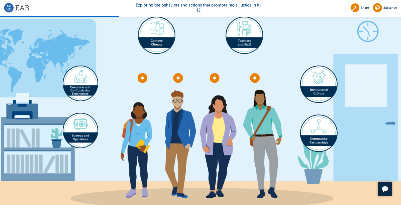
Hallmarks of an Anti-Racist Institution
A Digital, Interactive Infographic
Project Summary
My Role: Visual Designer
Timeline: 2-3 Weeks
Tools Used: Illustrator, WordPress Beaver Builder
Project Type: Responsive webpage
Background: Making progress on racial justice issues is an ongoing priority in the education system. In doing so, institutional leaders must include a balance of both short-term actions with longer-term strategies. They must also navigate the complex systems of K-12 education to uproot structural racism. But where to start?
Goal: EAB has defined a number of hallmarks to guide institutional leaders as they develop their journey towards racial justice. This infographic offers an interactive experience to learn about each of the hallmarks through the lives of four BIPOC community members. My primary role was to illustrate graphics and visuals for this experience that would inclusively represent the diverse set of personas.
My Process
Research
I began by reading through the descriptions for each of the personas. After that, I searched for a range of source imagery that would help me illustrate each character.
My goal was to make sure I was representing everyone in a positive way—which meant, checking my own unconscious bias throughout each stage of my decision-making process.
Here are the questions that I asked myself during the entire design phase:
Why did I choose this skin color to represent this character?
How have we illustrated a person with this race before? Where did we fall short?
What stereotypes should I be aware of when illustrating?
Who identifies with this persona’s background to who I can show this for feedback?
Design
After pairing the source imagery with each persona, I was ready to start illustrating. This was a fun project that allowed creative freedom, while also challenging me to remain intentional in my strategy to capture the impact of these stories.
Public School District persona illustrations.Independent Schools persona illustrations.Sample of supporting scenario illustrations.
“Thank you again for your hard work on this, and for creating persona designs that are culturally sensitive and appropriate. It’s been a blast working with you!”
— Strategic Research Analyst @ EAB
Challenges and Opportunities
Improve the UX of the toggle.
Right now the page has two separate toggles for the main illustration and the content below. This feature mixes up the information on the page. Since we don’t have a developer on the team, one solution I could think of is making the backgrounds and headers on the page a bit more distinct.
Continue asking questions.
In this project, I really stayed on my toes—constantly check (and recheck) your bias while illustrating personas. Ask questions, get feedback, and be inclusive!


